

During my A-level years I became more and more confident in fine art and focussed most of my energy on it during school hours. I loved being in the studio at lunch times and free periods – I’ve never been so grateful to have a desk and a wall all to myself; everyone who didn’t do art had a mere locker! To top it all we had probably the most respected teacher in the school. His colourful vocabulary was probably why we liked him so much. He'd also kick off big time if anybody was slacking so even though most of us were, at that lanky age, towering above him, he was the man.
I had hesitations about continuing fine art into degree level although it was my strongest subject at school and decided against it because of its lack of career prospects. You don't need to go to university to read books and explore your artistic side. I developed interests in graphic design in my last year of A-levels and ended up taking that route instead. When I heard there were life drawing sessions at uni I thought that using charcoal and an easel, rather than a pen and a mac, for a couple of hours a week would keep my imagination going.
By the end of my degree I’d attended life drawing classes once a week for two academic years. There were classes on for a while in the second year but as I entered the studio for the first class I was faced with a mass of chattering, overly-keen ceramics students; seeing the last easel in the corner of the room get swiped, I thought I'd wait until the next year.

In the first year of life drawing I was taught by a guy called Simon who had a great attitude and taught very well. In a typical evening we were encouraged to warm up with five or six five-minute drawings and then work on one main piece for the remaining hour or hour and a half. All of the drawings that I completed were at A1 size which really challenged me at first; I was used to drawing in an A4 sketchbook with a pencil. We tried lots of different things to improve our technique, our eyes and our understanding of composition and detail. I completed the drawing above by choosing from the scene a place to begin the drawing which would be in the very centre of the page. I chose the area below the model’s hand and worked my way out towards the edges of the paper. This caused an interesting composition that took the focus off the model and pushed it onto the various objects around him. The central draping sheet is the main point of focus because of its overt detail. This was another point that was made; we were to look at every object for what it was and not what we saw in our minds, and then draw only what made that object – be it the light, the marks on it, its shape…perhaps it has almost no outline to it.
We tried other means of drawing in our first year, like playing music from somebody’s iPod and working in response to the music. Jazz? You might mix swirling lines with more random thwacks or jolts of the brush/charcoal. Rock? The canvas might be covered entirely with repetitive marks and smears. We’d sometimes try very quick poses of about thirty seconds and frantically try to get the drawing down; this was a great technique and was, I've read, practiced by Egon Schiele who was known for completing drawings very quickly. It forced us to decide what is most important to the eye for recognition, namely the highest contrasts in light.
We also tried sticking torn bits of paper to our main sheet and then completing an hour-long drawing. When the torn pieces are removed the image becomes an interesting group of shapes. Similarly, the artist might use a different line/treatment of tone on the patches of torn paper than he does on the back paper and thus create an interlocking mix of two drawings.
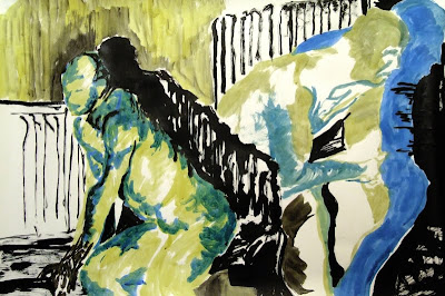
In my third year at uni I was back at life drawing classes. This time they were run by Petra Freeman whose animation work can be found through google. Petra’s thirst for work meant that we were only given about five or ten minutes for each pose. I suppose it was also to make the model's job easier but I appreciated it in any case; it meant I'd have to get an idea of the pose, whatever it could be, as quickly as possible. The drawing above was probably done in 15 minutes. I think that year was when I really began to trust my eyes…not just what my mind. In other words, if you think of a leg, you draw an outline, but if you see a leg, you should be drawing one surface and then another.


I think these drawings most easily show what I mean about drawing what you see. In each of the three is a series of poses which are intended to express movement. Thirty seconds was the time allowed on each pose so we were advised to look for the areas of high contrast only. Black ink was the right medium for the job, being as unforgiving as it is (once it’s down it’s down).

Once the artist has tried enough thirty-second bursts of drawing, five or ten minutes seems abundant. As above, the medium may cause restriction on a drawing if it offers only one tone – black. Nonetheless, I wanted to challenge myself to portray different areas of light, dark and detail using only ink. Of course, its possible to create surfaces of varying tone using only black; a solid black is darker than a patchwork of black lines, which is darker than a surface peppered with black marks.

Colour was a welcome addition to the drawing process in Petra's classes. I should point out that, under both tutors at Bath, I was never asked to painstakingly observe the human figure and seek perfect accuracy. There are many life drawing tutors who will prioritize accuracy and realism but these are not necessarily the most important issues we can concern ourselves with. As above, I explored mark-making and the relationships between colours. I had read in the past about the way red and black act together in a typographic context; the red comes forward, the black recedes. To learn this by experience is more valuable. Looking at the figure on the left, I wish I had swapped the red and black around as they seem to be fighting for a place in the foreground. The forward part of the body is in a receding colour while the far edges are pushed forward in red, making a flat appearance.


These drawings, however, make better use of the limited palette, brown and blue. Its likeness to red means the brown comes forward on the paper while the less vibrant blue takes the background role. Petra had us consider the shadows in a scene ever since the start of the year and this also really helped to train our eyes. Shadows, after all, are much harder to make up or vaguely re-create. Ironically, it’s only when they’re treated boldly that they take on a subtle appearance in the drawing. In the higher of the two above, the shadow actually draws the lower right side of the figure by making a boundary. Going back to what I said earlier, I was learning that what might, at first, look like a line is, in reality, a clash of two planes. The shadow is not part of the body, but in drawing it, the body is added to.
In the same drawing, I find it interesting that the eye will accept the figure as being in the foreground although a lot of its surface is blank like the rest of the paper which signifies a wall behind the figure. Perhaps this explains, in part, the value of using only three colours in graphic design; used correctly a fourth or even fifth colour can be made by way of illusion. You may have seen those experiments where a coloured box is placed on a white background, then on a black background and it appears a different colour because of the influence of its surroundings. Perhaps a similar thing is happening in the drawing.


I have added a couple of close-ups taken from my drawings which I think illustrate another feature of my work; I seem to have no style. I never set out to use the same technique of drawing over and over in order to refine it as if it were my signature. Many illustrators today copy one another or their own successful one-offs in the hope of creating something new and instead add to an enormity of visual tripe. Many of my drawings I would call ugly in some ways. Then again the Eiffel Tower seemed to catch on. I had read about Egon Schiele's rapid drawing technique and his haste in making all of the drawing errors and mistakes that he could sooner rather than later. I wanted to do the same, and more or less welcomed faults in my drawing so I could avoid them in future. The look of my drawings, then, was probably informed most by my mood at the time, my confidence in being able to capture the pose and my medium. I also wanted to continue exploring what I'd learned in the first year about mark-making and building up the page with areas of different surfaces. This time, however, I had to do that with the figure alone, as there were fewer features to the surroundings.


By the last couple of months at uni I had stupidly rolled up every drawing I’d made in the life drawing classes. I’d photographed most of them fairly well until then just as a means of documentation but realized I had enough to make a decent sized book. I spent a couple of long days unrolling all fifty-two of them and trying not to get charcoal on my landlord’s walls as I stuck them up to photograph them properly. With a little photoshop work, to balance out the lighting on the images, I had eventually got them all looking as best I could with my facilities.
The final book uses a semi-gloss paper stock inside with a matte cover. In retrospect, I’d have used a matte paper stock for the entire book as it would reflect the paper the drawings were made on originally. Another lesson for a budding designer like myself; stick to necessity.
As for the layout of the book, I designed a simple grid which allowed the images two possible positions per page, and a common full-bleed image page to break the pace of the book. Only two possible positions may sound a little less than enough but the varied page orientation of the drawings (portrait/landscape) meant the visual appearance of the layout was not repetitive. The full-bleed images were always detail images of the drawing they sat opposite to. One further feature was a full-bleed image double-page spread. The two earlier close-up images of drawings were used as double-page spreads and this further added to the variety of page layouts in the book. Any page numbers and descriptions of drawing media are set in muted colours to allow the images to dominate the pages.
No comments:
Post a Comment