Friday 28 December 2012

Christmas campaign

I came up with the concept behind this Christmas campaign for our local shopping centre after they'd briefed us to relate it back to their existing Christmas tv advert – which was based around the word 'if' (i.e. 'if you could have it all in one place' and 'if you could give everybody everything' etc).

It was great to have worked on a fully-fledged campaign that allowed us to arrange for a photographer to help us get the ideal shots. What we achieved was a warm traditional idea of Christmas, and definitely ensured that shoppers would know where to go during the festive season.

Frenchgate Doncaster Christmas

Monday 22 October 2012

An article, a designer and a zoo

Have you ever spent way more time browsing the internet than you originally intended – due to constantly finding links to bigger and better stuff? Well now you can re-live the experience! . . by following my footsteps into the world of designer Craig Oldham.

Firstly there was this very interesting article found on a distractingly interesting website:


Then I saw his website, which is unusually text-heavy for a graphic designer. It was nice to see that it gets away with being text-heavy though. Start reading and it's difficult to stop:


And then I found out that he worked on that really nice new stuff that Chester Zoo is rocking these days. It's a small world:


So now I'm off to sulk about being lead astray from what I actually was trying to research! Saucy pics of Rie Rasmussen will have to wait.

Sunday 14 October 2012

Tuesday 4 September 2012

A good site for all-round graphic designers

GraphicMac is a great source of information on both the Adobe creative suite and web design – with lots of other updates about computing in general as well.

Bookmark it and keep an eye out for handy tips.

Saturday 25 August 2012

Monocle

My favourite magazine right now is Monocle.

The topics it covers – food, drink, travel and business – aren't really what interest me about it. It's the illustrations and the design in general that make me keep wanting to buy it each month. And since I'm so into the visual side of it, I've started to read it more.  It's also one of the few magazines available from national stockists that doesn't use cheap glossy paper.

Friday 24 August 2012

Women of Florence

From a book called 'Women of Florence' that I got on a free online archive. Nice foliage!


Thursday 23 August 2012

The Form Book

Borries Schwesinger produced this superb book about form design.

The subject of the book was also the focus of Borries' dissertation earlier on in his career. He built upon his dissertation with more written and visual content in order to produce what I think is the only book worth reading if you want to learn more about forms. He talks about their history, design, and use. It's not common that people write about how designs are actually used by the general public but in this book it was unavoidable. So it's interesting to read what he says about how people use forms.

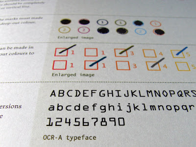
The book has a striking cover design. It's a pattern of alternating green diagonal lines with some low-key typography overlaid. He uses a thin stock for some of the first few pages that feature full-bleed images. Definitely something an all-round designer should consider adding to their book shelf.


Tuesday 21 August 2012

Got a spare 3 minutes 29 seconds?

This video makes a run down of the 100 most valuable businesses in the world. They could have just put up a list of names but oohhhhh no, they dance for us! Nothing but 110% effort went into this . .

www.wwp.com

3 illustrators you might like

Malika Favre
She used to work at Airside – some really incredible illustrations that play with positive and negative space in a way that I've not seen in much other work. Ultra cool stuff.


Amy Martino
Watercolour-effects and clean lines. Subtle gradients, patterns, strong colours. Like it muchly.


Cristian Turdera
Intricate details, muted colours and an endearing, playful nature. His books are definitely the strongest form of his work I reckon.


Sunday 19 August 2012

Common Interest

Emmi Salonen has designed a book that documents the work of a variety of studios around Europe.

It's printed on an uncoated stock and has an unusual cover design as you can see in the photos below. The first few pages describe forms of paper folding and the main body of the book is made up of spreads, one per project, with a simple overview of the printing specifications on the left pages. No detailed written content to be found here but nonetheless it's a nice collection of images for inspiration.

The typography and layout is quite refreshingly different and there's a nice combination of different paper stocks used inside.


Saturday 18 August 2012

The Bridge

I recently got a new DVD tv series called "The Bridge". I've only seen the first four episodes and I can already say it's definitely worth getting.

The plot is quite original – it starts with a body left on a bridge, exactly on the border, between Sweden and Denmark. You learn more about the body but I won't ruin the surprise. Anyway, because the body is half in Denmark and half in Sweden, both police forces are involved. The two main characters (a detective from each country) are really interesting to watch. I recognized one of them from the film 'Arn: Templar Knight'. She plays Saga – a really straight-talking, quirky character with not much of a sense of humour. Someone likened her to 'House' on Amazon. I sort of agree.

The soundtrack has grown on me since I started watching this – it's called 'Hollow Talk' by Choir of Young Believers. Really amazing how music becomes more meaningful when its used in certain contexts.

3 graphic designers you might like

Julia Hoffman
I found out about her when I saw some of the in-house work produced by MOMA – where she currently works. Her editorial work is some of her best, I think. The amount of detail in her infographics is pretty staggering.


Ross Gunter
Loads of bold graphics, marks, patterns – the 'bridging the gap' poster series is really striking. Good mix of tones in the colour too.


Mike Abbink
Like his branding and identity work – especially the application of his Legion of Honor logo . . but you'd need to create something horrendous to make Vermeer look bad.


Wednesday 15 August 2012

3 design studios you might like

Drexler
Okay their website got me hooked – but look at it! It's so original. They do a lot of varied work (not just for print) and they do it well. They're based in Baltimore.


Tsto
The colours they've used for their website are stunning. Nice functionality on their site too. Very experimental – I'd like to see how their studio looks after a busy day. They're in frosty Finland.


Atipus
Love their 'summer holidays' project. Nice work on some wine bottles too. Barcelona-based.


Monday 13 August 2012

Branding beyond visuals

The agency I work for has been tasked by lots of clients to enhance their brand, and we, as designers, have been mainly concerned with how things look. These same clients will have depended solely on us to manage their branding so it has been up to us to educate clients about how else their brand can be improved (apart from using visuals).

The opportunities can be uncovered quite easily – you just have to ask the following: how should the brand look; how should it smell; how should it taste; how should it sound and how should it feel?

After all, admit it, you've smelled every book you've ever bought, right? . . . right?

Mood Media and Air Aroma are two starting points if you're interested in learning more about developing the customer experience sans graphic design.


Saturday 11 August 2012

Weekend lettering

Some hand-drawn stuff inspired by Louise Fili – really love her work and it was cool to find out how much she knows about Florence and Italy in general. I really like the colours I've used below – I took them from a poster I saw recently. Might have to get the image from my work computer to show you the poster I mean.

Lettering Script Hand-drawn

Advertising for graphic designers

Any graduate of graphic design may find very early in their career that they're asked to produce adverts (both write and design them) and, even though their degree course may have said nothing about advertising, it'll be their choice to sink or swim.

I don't think it matters how little the client is paying for the advert – most designers would surely want to make the best of it that they can (within reason). So the following books are hopefully good starting points for designers who want to learn about advertising/writing – and I've found them really useful myself.

1. The Advertising Concept Book
This is a superb book which is as impressive in its design as it is in content. Every example advert (there is at least one per page) has been re-drawn in pencil – demonstrating one of the main points in the book . . that every idea starts with a pencil and paper.

2. Advertising Now! Print
Full of really creative adverts – this one will be useful to have open while you're reading the book above. Plus, there's an article inside it that I've included below – it's a really clever piece of writing that includes some good information about copywriting.

3. Writing that works
Although not directly linked to advertising, this book will definitely give you something to think about. One simple and seemingly obvious point from the book is: people don't care what you have to say about yourself, but they'll listen if you talk about them.


Saturday 16 June 2012

The Atlantic / In Focus

If you like keeping up-to-date with world news, and you prefer the visual side of information, take a look at The Atlantic's 'In Focus' section on their website. They update it every day with a great collection of 10-20 press photographs on a particular topic. Have a look back at the Queen's Jubilee page (see below).

http://www.theatlantic.com/infocus/

Queen's Jubilee In Focus

In Focus

Mega Laughs

➔ Please do not copy any image from this blog without permission; I keep proof of ownership on all of my work ☺