Another magazine to look out for if you're a designer with or without any interest in running, Runner's World.
Although the cover is nothing to shout about (it's very busy and, although I'm not an enemy of white backgrounds, it just lacks kapow) when you look through the inner pages, there are usually lots of great infographics that use bright bold colours and some really refined creative work in the main articles. The last image below shows the title design for an article called 'The sum of your parts'. On the same spread, they've created images of bio-mechanical people doing whatever runners do when they're not running. Really interesting stuff – get yourself a copy – you can pretend you're into running and that you're ultra fit.
Showing posts with label magazines. Show all posts
Wednesday, 27 February 2013
Tuesday, 12 February 2013
Jamie
I read somewhere that you can find some great design in magazines that appeal to a smaller or more specific readership. So, ever since, I've flicked through every magazine I've come across in search of inspiration. It's not always convenient though - standing in Sainsbury's perusing Marie Claire gets me some funny looks.
I didn't find anything in Marie Claire, but I did in Jamie Oliver's magazine 'Jamie'. Could I be right in thinking it's the only magazine ever to have been given a first name as its title? Hmmm.
The way the dots on the masthead are allowed to be sliced off by the top of the page is a nice touch – you probably couldn't do this with whole letters but it's a good idea that you can call upon if ever the ascenders/descenders/dots in a word are getting in the way or using too much space.
The magazine is given a minimal look for the longer articles and then a more scatty layout for pages with lots of little bits of information. I say scatty but I know from experience that getting something to look scatty without looking as if it's just been thrown down is among the tougher jobs in magazine layouts.
Colour is abundant on most pages - maybe to emulate the hodgepodge of hues found in your average dish – and lots of the typography/illustration is rough-and-ready and has a hand-drawn look (reflecting the emphasis on using your hands while you're cooking). Ben Mounsey contributed to the issue featured below.

Saturday, 26 January 2013
Hey you! Hast du Taschen?
It was only a couple of years ago that I heard that Taschen still sends out printed magazines about their latest books. They probably send out about three each year, so although it's not frequent, it's a nice surprise when it finally turns up in the post. The magazine is pretty much a collection of adverts about their books with two or three articles thrown in and a few different features that are repeated each issue, e.g. there's a page where famous authors comment on a particular Taschen book that they like. I just wonder if Taschen give them a list of 'suggestions' as to which book they comment on.
Anyway, what are you waiting for? Sign up for the free mag at Taschen's website
Saturday, 25 August 2012
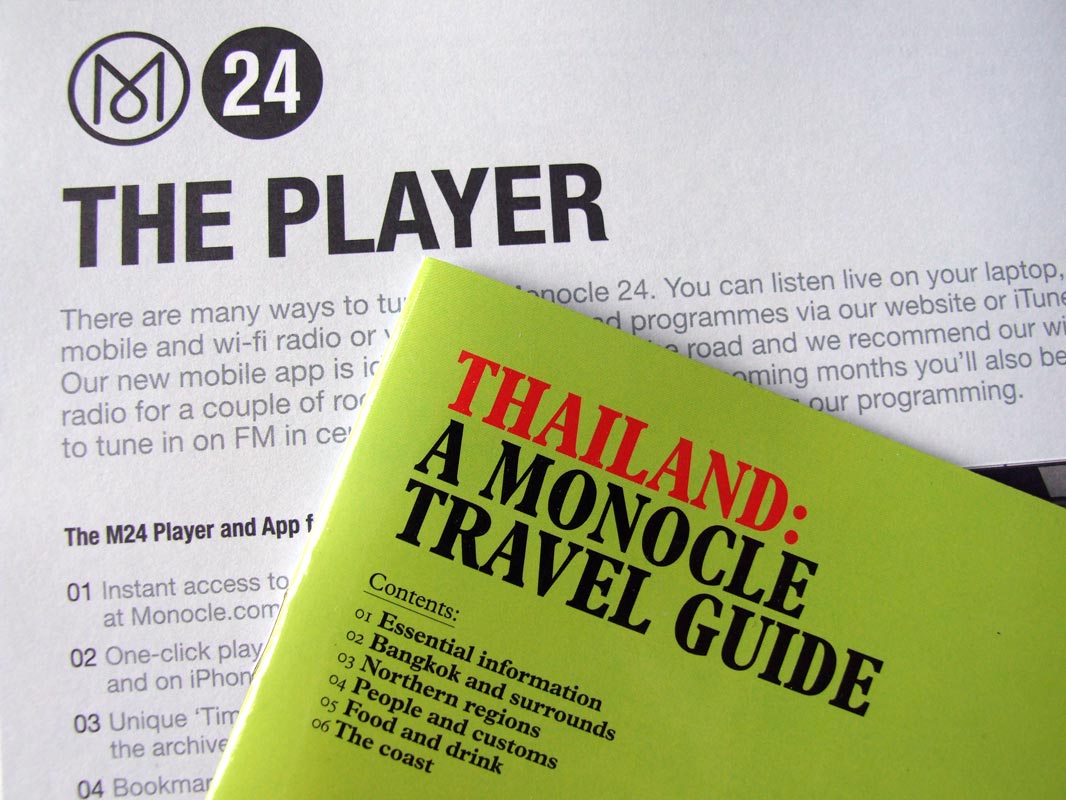
Monocle
My favourite magazine right now is Monocle.
The topics it covers – food, drink, travel and business – aren't really what interest me about it. It's the illustrations and the design in general that make me keep wanting to buy it each month. And since I'm so into the visual side of it, I've started to read it more. It's also one of the few magazines available from national stockists that doesn't use cheap glossy paper.
Subscribe to:
Posts (Atom)
➔ Please do not copy any image from this blog without permission; I keep proof of ownership on all of my work ☺