Thank you ‘transform again’ function

Thursday, 29 October 2009


Wednesday, 28 October 2009

Saturday, 24 October 2009
3D Type tests
I’ve noticed a lot of my work tends to say ’shush’ instead of ‘shazam!’ So in a bid to interject a little more vibrance, where necessary, I’ve looked closer at graphic work around me that catches my eye and figured out what the major culprit is; light!
I say light and not ‘the third dimension’ or ‘depth’ because designers needn’t spend time in Photoshop drawing up 3D type when they could be more economical with their time and achieve the same goal by easier means. Namely, we can go into Illustrator or even inDesign and still manage to add a sense of depth to a piece of text.
I’ve taken a mental note of the various ways people are using a lighting effect of some sort, be it colour gradients or lens blurs, and tried each one to see the results. Knowing all this now, I’ll be able to employ these tricks more in my work.
This one below demonstrates two means. If you ignore the black you can see a colour gradient is used — although it won’t make a 3D look, it makes the text appear as though light is hitting it…like it’s affected by the surroundings (almost 3D). With the black midground hugging its edges and the white background, it employs a graffiti artist’s method in creating levels of depth (fore/mid/backgrounds).

This one doesn’t blend colours like a colour gradient, but just uses two solid colours. More economical in some ways and still gives the sense of light hitting it.

.


Having had a peak at Apple’s website, I noticed how much they use subtle effects on their type designs/buttons to lure us in with their shiny splendour! I’m still not sure which method is best exactly, but I’ve included my attempts below.
This one is simply white text on a background that uses a gradient. The text is given a very blurred outer glow.


Tuesday, 20 October 2009
Berlin light bulbs
A few years ago, in Berlin, I saw these amazing old light bulbs in a museum. Their sort of shamelessly 100% functional nature stood out among the other things on display; fancy old telephones and decorative post office signs were in abundance. What I’d give to see one of these bulbs as big as the London Gherkin.


Sunday, 18 October 2009


Thursday, 15 October 2009
Play 08 height:width ratio

The next steps in designing the letterforms were based on the positioning of the circular guide. Clearly, this informs the width of the letter but it also makes the subtle details more exaggerated. With, this time, 2 variable points on the letterforms and, like before, 2 possible outcomes (rigid/curved) there are 4 versions of letter of each width available in the end.


Play 08 Letter Y
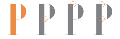
To explain the gloriously variable amount of detail that typography asks the designer to contemplate, I’ve uploaded 16 versions of the letter Y that offered themselves to me as I was working on my latest drawing of the word ‘play’. I focused on a heavy-stroked classical serif style and, settling on a reasonable height:width ratio, I decided to consider the four points in the character where the strokes would change in weight. Their positions can be seen below where the red circles lie. On each grey letterform, red circles show where a change has been made to the original letterform (which is the first one in red/orange).

I began with the lower half, as above, then altered the upper half and carried on with different combinations of changes to acquire the 16 variations of the shape (by making 4 variable points on the original letterform, 15 further outcomes are expected).


The final letterform (shown above, twice, at the end), with its 4 variable points altered (from rigid/straight to curved) is the furthest away from the original in aesthetic terms. My decision to limit myself to having only 4 points that I could change and only one way in which I could change them (rigid/curved) meant that I would get 16 different letterforms. The number of possible changes that I could make to the original letterform is enormous though.
Considering how subtle the differences are in the letterforms above, I wonder if it is more worthwhile to achieve originality through subtlety rather than blatant contrast. Looking at the last image above, where the original is placed with the final version of the letter, it appears that, although they share an elegance in form, they could each be used for different functions. The original, perhaps, could be used to suggest a modern /technological subject and the end result, a more historical/classical one.
Play 08

The ‘play’ series was started as a means of typographic exploration. The primary task is to draw the word, ‘play’, in whatever form (readable or not) as a starting point for learning whatever I can about type/software/drawing processes.
My more recent attempts have taught me a number of things about how best to transfer drawings to computer and how re-draw them once they’re made digital. I’ve also noticed the benefits of working both by hand and on computer; each method allows me to explore parts of my typographic drawings more than the other.
Granted; the exploration I have made so far has not been in great depth. This is because there are so many variables when it comes to drawing even just one letter and, being a stickler for organisation, I like to keep track of every change I make to a drawing. More playful drawings are yet to come, I hope, but for the next couple of posts I’ll illustrate the sheer amount of miniscule detail that could come into play with typography.
Wednesday, 14 October 2009
www Alanna Cavanagh


Tuesday, 13 October 2009

Monday, 12 October 2009

Friday, 9 October 2009
www Ben Cooper
I thought I’d add the site of a guy I went to uni with. He has some incredible computer skills and, as you’ll see, a knack for design too! Whereas I, as yet, only have a knack for design…grr. If you’re after a design (particularly for a website/software), I can’t think of anyone who’d be more keen to help you out.
http://ratticon.com/port_index.html
http://ratticon.com/port_index.html
www Jessica Hische
This site has some beautiful typography. The whole look of the site makes up part of a wider aesthetic style that I find excites me the most. I’ve seen it in Warner Brothers artwork, 1920s posters, films like City of Ember and games like Bioshock. I’m still not sure exactly what ‘style’ I’m talking about — I just know it when I see it, and am trying to collect examples to figure out what ties them together. It’s obviously colour combinations and pairings of typefaces but which colours and what typefaces? Hopefully I’ll know soon enough.
http://www.jhische.com/
http://www.jhische.com/


Subscribe to:
Comments (Atom)