One of my main projects of work during the last year at university was to type-set Voltaire’s novel Candide. I’d read it during my French A-levels and enjoyed the fast pace of the narrative, the variety of characters and locations and the underlying theme/philosophies of ‘optimism’. I’m amazed it hasn’t been made into a film yet; Terry Gilliam could have some fun with it.
The point of the brief, type-setting a complete text, was to challenge us to work with a large amount of information, to test our ability to work out interesting consistencies in the text and to present the text in a relevant and original way.
I first noticed that the book was largely balanced in narrative and dialogue. Footnotes had also been included in the original novel so I wanted to bring them into the design and make them more appealing to the reader as I found it laborious sifting through the back pages for the relevant note in my own copy of the book.
I learned what I think is the most logical way of setting a new text. I paid no attention to page sizes or formats. I opened an enormous document on InDesign and focused on the text alone. I knew I had three units of information to work with — narrative, dialogue and footnotes (where applicable), so I used Latin text to simply play around with the idea of three text styles. How would they contrast? How many forms of contrast are necessary? If I give each of the three texts a position on the page, will that be enough contrast? How should footnotes look? Will they disrupt reading if I put them in the text? Could they run vertically on the page as a means to show the information addresses the reader in a different tone?
I like the fact that there are so many variables to type-setting. Every decision made should be reasoned but the further something can be pushed before it loses clarity or meaning the better it is.
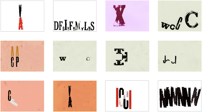
I began to work on the pages that would introduce each new chapter and felt it most suitable to do something a little more hands-on. I felt that using type a little more liberally may make a nice change against the very solid look of the narrative that I’d be developing.
I played around for a few hours over a number of days and eventually settled on using two typefaces, black ink, and a pale green paper. The paper would later inform the colour of the dialogue of the main character; I chose a dark purple/black which, I think, complements the chapter pages. The final 30 images work similarly to a timeline. The smaller letters represent characters mentioned in the chapter title and the larger letters suggest a location mentioned. If a character is leaving a location s/he is placed on the right side of the page, and the location on the left. If the chapter discusses how a character goes towards a new location, s/he is on the left and the location is on the right.
The final layout of the text and images informed one another. A grid was in place for the text of the book so this allowed me to justify where the character letters would sit on the chapter images. On the large chapter image below (5th down), for instance, the letter ‘C’ on the left begins the list of characters and its position lines up with the side and bottom of the text grid. Small details like this really help to tie everything together sometimes.

The final text layout was actually able to be fitted into an A4 book — giving us A3-sized images. So, going back to what was said before, it was best to deal with the text itself first and worry about the page sizes later. A final text hierarchy was used to break down the information into narrative, dialogue, Candide’s dialogue and footnotes.


No comments:
Post a Comment