Tuesday, 25 August 2009

Creative photography: 5 projects

Whenever I was asked to deliver an image-based solution to a design brief during my four years of further education, I experimented mostly with photography and, in particular, ‘staged photography’. I do not refer to tableau vivant, but the wider definition of ‘staged photography’; no living models are used in my work but, rather, I set up scenes with hand-made objects that would appear most effectively within a photograph. The five projects discussed below are some examples of my most creative experiences with the camera.


Creative workshop


About half way through my year at Leeds College of Art and Design I signed up for a workshop that was set up to help those of us who were struggling to come up with a starting point for a brief of our own. A handful of us turned up in a small studio and were told to explore the room, documenting it in whatever fashion most appealed to us. We could draw it, measure it, photograph it, but we also had to decide what to draw/measure/photograph and this is how we each took an individual approach.

At the time, I think I’d just read about somebody who had spent time in prison (…or just looked very intently at a blank wall one day) and noticed the various marks and stains on the wall. He’d become fairly well-known for drawing miniature scenes on walls by reacting to any stains and marks; his work had a punchy humour similar to David Shrigley's illustrations. One of his drawings turned a round grey stain on a wall into a swimming pool, by adding in little leaping figures. I wanted to explore the room with that level of focus. I would seek out all of the hiding holes, nooks and crannies and observe them as if they were rooms themselves. Below are two examples of my photography from that day.


I began to find a number of interesting places within that single studio space. If only I had a macro lens! I found great value in discovering unusual corners/cracks/gaps and photographing them in such a way that they appeared much larger than they were in reality. I was drawn to the keyhole, below, because it was more of an enclosed space. It was also somewhere I could use the camera to get an image that would place the audience in hiding, where they would feel like they were inside the cavity, looking out.


I wanted to carry on this exploration of hiding places and dark corners with a more controllable subject. I started to look at things I could explore from different angles and firstly used a simple cardboard box. After a short while of cutting and tearing I used the camera to capture some more intriguing spaces. I then played around with type and tried placing bits of acetate into the scene which would read ‘always hidden in the most unlikely places’ just to get a sense of how it would look. I also tried to project the shadows of the text onto areas of the box but found it difficult to fit it all into a space and lighting it properly at the same time.


I finally ended up with a model that I'd made using drawings which were completed in a workshop we attended; whatever our personal projects involved, we were asked to make a series of drawings in response to our work so far. I decided to draw the various parts of my cardboard box. Combining these with prints of my earlier photographs, I put together a rather strange model that would be used to create more photographs. The process almost became like putting a mirror in front of another mirror. I could make drawings and take pictures of my latest model, then make a new model with that…then make drawings and take pictures of that one and make an even more detailed version.


Granted, I had little control over my line of enquiry during this project. This didn’t seem to bother my tutors, on the contrary, so I used the opportunity to simply exhaust every visual possibility. Thinking back, perhaps I was undecided on what I wanted to communicate. Was the audience hidden, as the camera? Or was I seeking out hiding holes and taking pictures? If I were given the chance, I’d go back and create an over-sized version of one of the dark spaces in the original studio space and place the camera inside it to find out what it would be like to be an inch tall, hiding inside and peering out.


Words in Space


In my second year at Bath Spa Uni, I received a brief by the title above. The task was very open to creativity and placed no restrictions on the student. We were asked to respond to the title with an image or series of images.

After several quick experiments and failed attempts, I settled on the idea of cutting out words from newspaper headlines. The frail nature of the paper meant I could use only the largest words. Once cut out, I'd stick them down onto greyboard and cut away the counters and negative spaces. I was basically left with ten or twenty shapes to play with; each was a different size to the next and had, to an English-speaking audience, its own meaning. As can be seen in the second image, I allowed the meaning of the words to evoke new images themselves, like a ‘cheap sink’. Evidently, my method of exploration relied heavily on making mock-ups and 3-D models.


Shooting in black and white forced me to pay attention to the way the light was working in my little typographic doll’s house and this was probably what helped me make an image like the one saying ‘cheap sink’. I noticed I had about four different methods of creating a word; the cut-outs themselves, the shadows of the cut-outs, a silhouette of the cut-outs, and when the words would be cut into a panel of card, like a stencil frame. Combining these methods would usually achieve interesting results.


My final solution to the brief was this set of three A1 prints. I found them successful, especially printed so large, in fooling the audience into thinking they were originally much bigger than a shoe-box. The selection also appear to give just enough detail of the background, where more words engulf the space as if it were a theatre set.


I felt, at first, that the brief was too open but, eventually, I warmed to the idea of making random experiments and investigations. Nothing was expected or intended and happenstance ruled the outcome. Once I began to notice things happening to my advantage, like the extra visual device of the shadows for instance, I would exploit them and try to allow for them with every other snap of the camera.


Hidden


Immediately after the Words in Space brief, I set to work on another called ‘Hidden’. Just like the previous brief, we were given complete control over the outcome provided it was the result of an image-making process.

After the usual hilly start, I decided how I would interpret the brief. All I need to know was what would be hidden. I thought back to my foundation year at Leeds and my work that followed a similar idea, only I'd never properly engaged with the idea of hiding the audience.

I knew from experience that a photograph from inside a dark space looking out at a lighter area did not evoke a connection to the audience without suggesting movement of the camera. I wanted the audience to look at my photographs and feel like they themselves were hidden.

What was needed was ideally a way of making this effect anywhere I pleased. Something had to be made that could attach to the camera somehow; this way, the camera could be put anywhere and still allow the audience to feel hidden. The solution was fairly simple. I rolled up a long sheet of black paper, thick enough to slide over the end of the camera lens. Before attaching the roll of paper, the camera would be given a long shutter speed and focused on its subject. With the roll of paper held around the lens the shutter would then be released and the roll of paper allowed to move around. I experimented by moving the paper quickly, slowly, to and fro, back and forth but found the best method was allowing it to move slowly a few inches before the shutter closed.


The result was an intriguing visual affect which I think suggests a number of things. It could be a memory, a fleeting glance, a visual impairment, what happens when you get hit by Frank Bruno or, as intended, the obscured vision of a hidden person.


I was most happy with this project because I’d created a form of image-making from scratch. In the professional world, image-making devices similar to this one (but a little more refined!) are bought and sold for lots of different intentions so it was of little importance, at that stage, that my images did not exclusively communicate ‘hidden’.


Manet


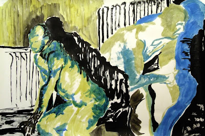
As a personal project in my second year at uni, I wanted to carry on my stage-craft photographic experiments. I challenged myself to somehow bring to life a selection of paintings by Edouard Manet who I'd studied at A-level for my major essay. A large part of his work was related to Spanish culture because of Spain’s influence in France at the time, and also because Manet himself visited Spain to experience the world of bull-fighting.


I set out in a similar way to how I’d done for the Words in Space brief and cut out the figures themselves from the paintings. As shown above, I made little models with the cut-outs and researched shadow theatre and the puppets that are involved. This youTube video gives you an idea of what I was reading about: http://www.youtube.com/watch?v=WuN6bIuUK1g 


Unfortunately a shadow theatre play was maybe biting off more than I could chew so I stuck the original plan and carried on with the photography. 


The point of making these images was to narrate Manet’s work on Spanish culture. What is most appealing to me about his work on this subject is that, although he went to Spain to observe his subject, he completed the paintings back at his studio in France. In the original painting above it’s quite clear that the visual perspective fails to convince us – unless, of course, the rider and horse in the background are actually only three feet tall. This would demonstrate one of the issues Manet must have contended with; piecing together his sketches from Spain with a model’s pose at his studio.


The relationships between Manet‘s work and that of his idols Goya and Velazquez was also a significant feature to his paintings and, with my stage-craft approach, I could set up a scene which might involve recognizable characters from older paintings alongside figures from Manet’s work. The image above, for instance, shows Manet’s firing squad from The Execution of The Emperor Maximilian. Behind them is Goya’s Third of May which, itself, depicts an execution; without getting too far into the details, Manet appeared to liken his painting to Goya’s for political reasons.


Kaleidotype


I came up with this awesome name for a project and just wanted to do something that reflected the name. …only kidding! I was racking my brains one day, as is a designer’s want, and wondered what it would be like if the shapes inside a kaleidoscope were not just pretty shapes but beautiful letterforms! By the way, if you steal my idea, I’ll hunt you down …again, only kidding. 

…not. 

Anyway, it’s quite straight-forward as an idea; unfortunately it’s not as simple to build the things. Nonetheless, when you finally get it working you can add any typeface you like and really play around with it. I was easily excited by my new ‘shiny shiny’ object and didn’t bother trying to build something that looked good – not on my budget! But I did explore the possibilities in what typefaces you could use, how you could perhaps cause words to appear and, eventually, I turned the patterns inside the kaleidoscope into graphic drawings and used one of these as a self-promo device. So I definitely rinsed it of its image-making capabilities.


They always make me think of a potential nightclub interior design – not sure who’d go though…it’d have to be a club for type designers only. What?! It’d catch on! Below is my self-promo device, as aforementioned. As it is, it’s quite dull, but used in small doses and with colour, it’s a nice eye-catcher. It currently embellishes the inner spine of my box portfolio…until the sellotape wears off underneath.


Sunday, 23 August 2009

Life Drawing


During my A-level years I became more and more confident in fine art and focussed most of my energy on it during school hours. I loved being in the studio at lunch times and free periods I’ve never been so grateful to have a desk and a wall all to myself; everyone who didn’t do art had a mere locker! To top it all we had probably the most respected teacher in the school. His colourful vocabulary was probably why we liked him so much. He'd also kick off big time if anybody was slacking so even though most of us were, at that lanky age, towering above him, he was the man.

I had hesitations about continuing fine art into degree level although it was my strongest subject at school and decided against it because of its lack of career prospects. You don't need to go to university to read books and explore your artistic side. I developed interests in graphic design in my last year of A-levels and ended up taking that route instead. When I heard there were life drawing sessions at uni I thought that using charcoal and an easel, rather than a pen and a mac, for a couple of hours a week would keep my imagination going.

By the end of my degree I’d attended life drawing classes once a week for two academic years. There were classes on for a while in the second year but as I entered the studio for the first class I was faced with a mass of chattering, overly-keen ceramics students; seeing the last easel in the corner of the room get swiped, I thought I'd wait until the next year.


In the first year of life drawing I was taught by a guy called Simon who had a great attitude and taught very well. In a typical evening we were encouraged to warm up with five or six five-minute drawings and then work on one main piece for the remaining hour or hour and a half. All of the drawings that I completed were at A1 size which really challenged me at first; I was used to drawing in an A4 sketchbook with a pencil. We tried lots of different things to improve our technique, our eyes and our understanding of composition and detail. I completed the drawing above by choosing from the scene a place to begin the drawing which would be in the very centre of the page. I chose the area below the model’s hand and worked my way out towards the edges of the paper. This caused an interesting composition that took the focus off the model and pushed it onto the various objects around him. The central draping sheet is the main point of focus because of its overt detail. This was another point that was made; we were to look at every object for what it was and not what we saw in our minds, and then draw only what made that object – be it the light, the marks on it, its shape…perhaps it has almost no outline to it.

We tried other means of drawing in our first year, like playing music from somebody’s iPod and working in response to the music. Jazz? You might mix swirling lines with more random thwacks or jolts of the brush/charcoal. Rock? The canvas might be covered entirely with repetitive marks and smears. We’d sometimes try very quick poses of about thirty seconds and frantically try to get the drawing down; this was a great technique and was, I've read, practiced by Egon Schiele who was known for completing drawings very quickly. It forced us to decide what is most important to the eye for recognition, namely the highest contrasts in light.

We also tried sticking torn bits of paper to our main sheet and then completing an hour-long drawing. When the torn pieces are removed the image becomes an interesting group of shapes. Similarly, the artist might use a different line/treatment of tone on the patches of torn paper than he does on the back paper and thus create an interlocking mix of two drawings.


In my third year at uni I was back at life drawing classes. This time they were run by Petra Freeman whose animation work can be found through google. Petra’s thirst for work meant that we were only given about five or ten minutes for each pose. I suppose it was also to make the model's job easier but I appreciated it in any case; it meant I'd have to get an idea of the pose, whatever it could be, as quickly as possible. The drawing above was probably done in 15 minutes. I think that year was when I really began to trust my eyes…not just what my mind. In other words, if you think of a leg, you draw an outline, but if you see a leg, you should be drawing one surface and then another.


I think these drawings most easily show what I mean about drawing what you see. In each of the three is a series of poses which are intended to express movement. Thirty seconds was the time allowed on each pose so we were advised to look for the areas of high contrast only. Black ink was the right medium for the job, being as unforgiving as it is (once it’s down it’s down).


Once the artist has tried enough thirty-second bursts of drawing, five or ten minutes seems abundant. As above, the medium may cause restriction on a drawing if it offers only one tone – black. Nonetheless, I wanted to challenge myself to portray different areas of light, dark and detail using only ink. Of course, its possible to create surfaces of varying tone using only black; a solid black is darker than a patchwork of black lines, which is darker than a surface peppered with black marks.


Colour was a welcome addition to the drawing process in Petra's classes. I should point out that, under both tutors at Bath, I was never asked to painstakingly observe the human figure and seek perfect accuracy. There are many life drawing tutors who will prioritize accuracy and realism but these are not necessarily the most important issues we can concern ourselves with. As above, I explored mark-making and the relationships between colours. I had read in the past about the way red and black act together in a typographic context; the red comes forward, the black recedes. To learn this by experience is more valuable. Looking at the figure on the left, I wish I had swapped the red and black around as they seem to be fighting for a place in the foreground. The forward part of the body is in a receding colour while the far edges are pushed forward in red, making a flat appearance.


These drawings, however, make better use of the limited palette, brown and blue. Its likeness to red means the brown comes forward on the paper while the less vibrant blue takes the background role. Petra had us consider the shadows in a scene ever since the start of the year and this also really helped to train our eyes. Shadows, after all, are much harder to make up or vaguely re-create. Ironically, it’s only when they’re treated boldly that they take on a subtle appearance in the drawing. In the higher of the two above, the shadow actually draws the lower right side of the figure by making a boundary. Going back to what I said earlier, I was learning that what might, at first, look like a line is, in reality, a clash of two planes. The shadow is not part of the body, but in drawing it, the body is added to.

In the same drawing, I find it interesting that the eye will accept the figure as being in the foreground although a lot of its surface is blank like the rest of the paper which signifies a wall behind the figure. Perhaps this explains, in part, the value of using only three colours in graphic design; used correctly a fourth or even fifth colour can be made by way of illusion. You may have seen those experiments where a coloured box is placed on a white background, then on a black background and it appears a different colour because of the influence of its surroundings. Perhaps a similar thing is happening in the drawing.


I have added a couple of close-ups taken from my drawings which I think illustrate another feature of my work; I seem to have no style. I never set out to use the same technique of drawing over and over in order to refine it as if it were my signature. Many illustrators today copy one another or their own successful one-offs in the hope of creating something new and instead add to an enormity of visual tripe. Many of my drawings I would call ugly in some ways. Then again the Eiffel Tower seemed to catch on. I had read about Egon Schiele's rapid drawing technique and his haste in making all of the drawing errors and mistakes that he could sooner rather than later. I wanted to do the same, and more or less welcomed faults in my drawing so I could avoid them in future. The look of my drawings, then, was probably informed most by my mood at the time, my confidence in being able to capture the pose and my medium. I also wanted to continue exploring what I'd learned in the first year about mark-making and building up the page with areas of different surfaces. This time, however, I had to do that with the figure alone, as there were fewer features to the surroundings.


By the last couple of months at uni I had stupidly rolled up every drawing I’d made in the life drawing classes. I’d photographed most of them fairly well until then just as a means of documentation but realized I had enough to make a decent sized book. I spent a couple of long days unrolling all fifty-two of them and trying not to get charcoal on my landlord’s walls as I stuck them up to photograph them properly. With a little photoshop work, to balance out the lighting on the images, I had eventually got them all looking as best I could with my facilities.

The final book uses a semi-gloss paper stock inside with a matte cover. In retrospect, I’d have used a matte paper stock for the entire book as it would reflect the paper the drawings were made on originally. Another lesson for a budding designer like myself; stick to necessity.

As for the layout of the book, I designed a simple grid which allowed the images two possible positions per page, and a common full-bleed image page to break the pace of the book. Only two possible positions may sound a little less than enough but the varied page orientation of the drawings (portrait/landscape) meant the visual appearance of the layout was not repetitive. The full-bleed images were always detail images of the drawing they sat opposite to. One further feature was a full-bleed image double-page spread. The two earlier close-up images of drawings were used as double-page spreads and this further added to the variety of page layouts in the book. Any page numbers and descriptions of drawing media are set in muted colours to allow the images to dominate the pages.

Mother Courage

Very near the end of my third year at university I was speaking to a friend, a student of fine art, about his work; he needed to document all of the work that he and another student had done since September 08 (it was about March 09 when I spoke to him). They were also planning a number of events for the coming weeks and would therefore need somebody who could handle all of the information they had already as well accept more and more new material as they continued to work. They called themselves Mother Courage, after Berthold Brecht's character; they wanted to revive the concept of ‘the theatre of the oppressed’ whereby the audience is encouraged, at a play, to offer their opinion and even take the place of an actor in order to do so.

This concept does not necessarily end with theatre. Mother Courage used the concept of audience (the public) participation in activities which would engage them with a problem. The main issues they tackled during their studies were transport and sustainability in our crops. An example of their work would be the bike installation; Mother Courage set up a bike in the town centre of Bath which was connected to a screen. As passers-by would pedal the stationary bike, the screen was powered and a film was shown of MC’s interviews with a group of people who grow their own crops on local allotments.

Further information:

Being my first book-design project, I wasn't as comfortable as I'd have liked to be but I knew that all I needed to be confident was enough information about what it was MC wanted from me. I wanted to keep an open-mind at the early stages as ‘a book’ may not be the ideal solution to their problem. After looking at the content they needed to document, and considering the fact that they wanted to act like a practicing studio/consultant, I felt it best to stick with their original idea of a book – rather than, perhaps, trying an installation or some other approach.

The content for the book consisted, in the end, of six different types of information; e-mails (correspondence with the council, volunteers etc), messages to the reader (mission statement, event explanations etc) , messages from MC to themselves (invoices, checklists etc), prints and artwork, quotes of playwrights who support the ‘theatre of the oppressed’, and photographs of the events and installations.


As there was a huge number of e-mails to be added to the book, I felt they would act as the main ingredient – something constant that the reader would follow through the book. I received the e-mails as groups of forwarded messages, responses, threads of replies to replies and so on; I almost wet myself with excitement as I sat for days sorting through them…. Finally I had them in chronological order (the decision to put them in this order was because they offered a logical way to break up the pace of the book; the images of the bike installation, for instance, could appear on the relevant date in the book). As you can see, I chose a suitable line length for the content of the e-mails and worked around that to build a grid for the other information. The date is pushed forward with a condensed over-sized format, in red, and the words between it and the body text tell the reader the general subject of that e-mail. If you're looking for information about insurance for events, you need only follow e-mails whose subject list includes ‘insurance’.


I should say a word about the choice of colour for the book. MC had designed their own studio in the art department which was based on a high contrast division of the room – one side was painted black and meant to convey the radical side of their work while the other, a white Ikea-furnished office space, was there to suggest a service to the public. In other words, their public image would be quiet and orderly, while their working method was more unorthodox. I tried to reflect their studio in the book, using black backgrounds on messages from MC to the reader which tell us their real intentions without sugar-coating it, while white backgrounds show the correspondence and other administrative information like invoices.


Wondering what else I could do with the idea of high contrast, I applied to further pieces of content that appear now and then throughout the book to control the pace and give the reader something else to consider, like quotes and artwork completed by MC. On the subject of art and photography, everything in the book has been drawn/photographed by MC themselves and passed on to me for the design process. I learned that it really should be the designer’s job to handle the photography. For this project though, the usual process of book design had to be ignored as they'd already done half of their work and photographed it before coming to me. A lot of compromise had to made on which photographs could go where as, unfortunately, one of the cameras the students was using was not working at a high quality setting and some great photographs were only available up to a certain size; full-page bleed was not an option for a good number of images.


Some of the better images, however, did make it to full-bleed and really added to the book aesthetically. Next cover of Baseline magazine? …Aiming too high? These images were taken by one half of the MC duo as she was working on the design for the t-shirts which would be worn on the day of the event. I'd lost track of whose job it was to do what by then and limited my responsibility solely to the book…and some stationery I did after the book was complete – keep reading. Anyway, as is evident, the images work to a straightforward asymmetric grid, keeping in line with the e-mails. The decision to go with an asymmetric grid was informed by the need for the dates and subjects of the e-mails to always appear on the left; this way the reader could quickly find the relevant date by flicking through the pages.


Here we see the final product, a bit of it at least. At two hundred pages I'd say it was quite an achievement for a one-man-band; the content for the last twenty or thirty pages to the book was handed to me one day and I had to get the book to print the next, as MC’s dreaded deadline was nearing. You can actually see in the image a portion of one of MC’s prints, which acted similarly to the quotes in that they only appear every twenty pages or so to alter the pace of the book. The cover was originally going to include a rather iconic photograph of one of MC’s event t-shirts pulled onto a statue outside Bath Cathedral. The image turned out to be one of the poorer quality shots and could not be used. Instead I resorted to a simple typographic approach which worked on the high contrast characteristic of the book.

Mother Courage mentioned towards the end of Augusto Boal's obituary:

After the book had been made, MC exhibited their work during the Bath Spa University 2009 exhibition and asked me to provide them with a poster that would invite visitors to enter their studio at selected times and engage in conversation about their work. Using the same colour system and typeface, Univers (helvetica shmelvetica!), I came up with this quite bold and to-the-point poster which, I felt, kept to MC’s no-nonsense approach.


After a wee gentle persuasion, I convinced MC to let get them a suitable set of stationery to go with their book. Their logotype had already been designed by one of the students whose choice of typeface related well to the original form of play scripts (completed on typewriter). Carrying the high-contrast appearance and colour choices forward, I came up with the above business card (front and back). Their strap-line, ‘interact, educate, entertain’ comes from the theory of one of their theatre idols and explains MC’s work adequately.


The above letterhead was made to provide them with an inviting layout that uses the space on the page well. The vertical line on the lower left provides the details of MC, like their address, and also acts as a way of highlighting the content of the letter which would start at the top of the line, and about an inch to the right. The addressee's details are placed in such a way as to allow them to be seen when the letter is folded and placed in a window envelope. The strap-line will also appear in the window, just above the addressee, to give an idea of the addressor. I am learning more and more of the importance of function in design and caring less about the aesthetic result; where logic and geometry are put to good use, there is little chance of aesthetic inconsistency.

I mostly learned from this project that good preparation takes care of a huge amount of work and sees off most potential problems. For example, on sorting the e-mails I noticed a number of them had attachments, many were addressed to big groups of people and others included forwarded messages. If I'd decided on a grid/text format system before noticing this, I’d have wasted time. Quite obvious, perhaps, but when you're handling so much content you can get your priorities confused. I managed to figure out a way of pointing the reader to the page including the relevant attachments, making the addressees and addressors clear, and so on.

Looking for consistencies in the content you're handed is always worthwhile and repeatedly applying the basic needs of the brief to every problem can be useful. Early on in the process I began to consider possible designs for MC’s business card; I kept an open mind and tried not to resort to a simple business card. Could it be something unique? They had used a huge canvas which acted as the screen for the video that would be played while somebody pedalled the bike. I suggested cutting that up into pieces that were roughly business card size and screenprinting/painting/writing MC’s details onto them. This obviously didn’t happen in the end because of time restraints but would have made a memorable and meaningful object that visitors to the exhibition could pick up.

Saturday, 22 August 2009

Perfume

I completed a project in my third year at university called Perfume; the name, as you'll realize, refers to the book by Patrick Suskind. I was handed a brief at uni which asked me to take a novel, read it and consider the content. The final outcome had to present the content of the book, either in its entirety or just a selection, in an interesting and relevant way.

The film (which I recommend if you've not seen it) built up an atmosphere of smells using vivid images of food and grime, silks and powders, and so on and I felt that perhaps it would be interesting to explore the huge number (317) of perfumes, aromas and stenches that occur throughout the text. Not only are they impressively varied, from ‘stale dust’ to ‘the exhaled breath of thousands of hymn-singing and Ave Maria-mumbling throats’, the words themselves can be refreshingly unusual; ‘rhododendron’, ‘opopanax’ and ‘patchouli’.

As I was thumbing through and collecting the smells, it occurred to me how difficult it must have been for Suskind not to become repetitive when introducing each new olfactory sensation. I felt it necessary to go back and, this time, look out for every synonym for the word ‘smell’ that Suskind uses. So, by the end, I had 191 different words or expressions to substitute ‘smell’ and 317 words that described what the smell was.


With my selected content, I went to work looking for a way to present it. Most of the work had already been done; the content was an interesting collection of words, each of which holds olfactory significance. All that was needed was a way to keep them together that was meaningful and justified. This image shows one of many little tests I made; I explored the idea of cutting book pages in ways that would allow for inner pages, mini pages or even books inside books. Each page, in this test, has a sentence on it like ‘the foul stench of rotting cheese’. On turning part of the page, the reader creates a new sentence like ‘the beautiful stench of rotting cheese’, ‘the obnoxious odour of rotting cheese’ or ‘the obnoxious odour of sour milk’.

Page numbers cover the whole of the page so the reader can see what the sentence should be originally by putting the pages back until the shapes of the numerals line up. This also adds an interesting visual outcome when the pages are turned out of sync – the graphic forms of the numerals break up and form new accidental shapes.

The sentence itself is set with an altered version of Garamond – Suskind describes a smell as a ribbon at one point in the book which I felt could be a fitting typographic device. So I added to every letter in the Garamond family a small ribbon-like arm at the front and back and put the words and sentences together by lining up each letter manually.


Finally I had to face up to the harsh reality and print a mock-up that would suggest a final outcome for the brief, using all of my content (317 and 191 are bigger numbers than they seem). The image here shows my mock-up, an A5 sized book which takes forward the idea of pages with smaller pages cut into them.


The close-up image hopefully shows you how the book would work. The reader can flick through the smaller pages on the inside or the larger page, and find new variations of words and phrases – which, incidentally, always make sense no matter what combination is chosen. The reason I decided to put down three choices of sentences to each page was because of the way perfumes are, according to the book, created; they have three ‘chords’ which, themselves, are made of three ‘notes’. You may ask why I didn't put nine sentences on each page – I don't know anymore! I'm sure there was a reason but it's no matter, as the final outcome to the brief was actually quite a simple re-think of my mock-up. I had, all along, been experimenting with making two/three/four books inside one. I knew I had two sets of information so why not make two books? This would also make the task of binding the books easier, as it would have been tricky trying to bind a book with pages that only meet the spine at, say, the middle inch.


The final product is a set of two books which can be read together, side by side (one has the content ranged-right, the other ranged-left) so that, when the pages are flicked through by the readers hands in the middle, the books offer up thousands of new sentences – only one word/phrase is printed on each page and nothing else. The ribbon-typeface was dropped for its time consuming need to be handled manually but I managed to make up for that with a final touch of purple to the rather bold box cover colour. The ribbon was folded three times to allude to the three chords of a perfume – the smaller details count, no?

In the end I was well aware of what could have been done differently and what could be improved. The typeface used for the final books, Univers, is a very safe choice and would, I think, have been bettered by the altered Garamond with its ribbon-like quality. I had little choice over paper stock where I was making the book so, again, I'm sure if there was an ideal response to the content that I chose, it would have used a more suitable paper-stock. This all tells me that perhaps there is never one perfect response to a brief but millions of very good ones; the designer need only make the most of his surroundings and make the most of himself.
➔ Please do not copy any image from this blog without permission; I keep proof of ownership on all of my work ☺