The idea of hierarchy is a major part of design. It can be 'invisible', just like good typography, which is why inexperienced designers don't always have a good eye for it. Whether its achieved with the layout, the type size, colours or other means, hierarchy always plays a role in design.
I stick to the motto 'if you try to make everything stand out, nothing will stand out' because I've come to realise that people often confuse two separate issues: making text big enough to read, and making text big enough to be seen. Putting a telephone number on an advert, for instance, is not going to make people pick up the phone – it's purely information. It needs to be large enough to be read – and no larger. Whereas, if you had a unique selling proposition to shout about, it makes sense to bump up the type size.
I find that, especially when you're designing an advert for print, you should be able to first make a list of all of the text information in order of most- to least important. The text that's written to grab attention will be at the top: the text that is solely information, will go at the bottom.
The advert below shouts out 'vote yes' but it's unclear where to look next because of the confusion between the two columns – one is left aligned, the other centre aligned, and neither takes charge over the other because the contrast in type sizes is too subtle and the layout is inconsistent. It's an important message that was perhaps weakened by a design that was of a lesser standard that it should have been.
In this advert, right from the beginning the meaningful text struggles against the logo (because a poor decision was taken to add a tag line underneath it that requires the logo to be at least big enough for the tag line to be read). The designer was very reserved in their use of colour but there's a definite case of wanting-everything-to-stand-out-syndrome. The telephone number is some of the largest text on the design – but is it really going to sell holidays?
Ogilvy is the master of adverts that don't shy away from giving readers something to read. The headline is engaging, and the introduction gives you a reason to read the bulk of text that follows it. The visual hierarchy is admittedly simple, but there's no reason to ditch simplicity for 'creativity' when it comes to selling an idea or a product.
Tuesday, 19 February 2013
Tuesday, 12 February 2013
The Lives of Others & Stasiland
The Lives of Others is a 2006 German-language film about East Berlin during the 80s. It follows a playwright and an actress whose apartment is placed under full surveillance by the Stasi (the then Ministry for State Security). You get a real sense of their rigid and obsessive methods for gathering information about their own people, and Ulrich Mühe does an amazing job in portraying the main Stasi operative. I'd never seen Mühe in anything before, but after watching this, it was no surprise to read how popular he was as an actor – and that he'd had first-hand experience of the Stasi earlier in his life. I couldn't believe it when I read that he had passed away in 2007.
Although there is hardly any graphic design featured in the film, there are plenty of examples of severe minimalism and neutrality - be it in the architecture, the way people speak, the suppression of emotion, the order and discipline. All this makes me think of a visual graphic equivalent, like Jan Tschichold's early work – which he is said to have later described as being akin to fascism because of it's overly strict approach. It isn't something I've considered before – is it realistic to suggest that the obsessive nature of a designer could spill over into society and wreak havoc?
I was interested in learning more about the Stasi and the Berlin Wall, so I got a copy of Stasiland by Anna Funder. The edition featured here is really well designed – only two colours throughout. It is described as a collection of accounts by both victims and members of the Stasi, so I was expecting quite a linear chapter-by-chapter structure but actually the author blends all of the accounts into one long narrative with herself at the centre – as she goes along meeting new people in Berlin. It was interesting to see how many things from the book carried over into The Lives of Others, or vice versa, e.g. how the odd Stasi member might joke about their superiors and the sudden effects that doing so might have on their career.
YouTube, of course, has loads of videos about the Berlin Wall and the prison in East Berlin, and the links will take you to a couple that I recommend. In this video, you'll meet one of the people from Anna Funder's book – her story is totally heartbreaking.
Out of interest, I had a look on Eye Magazine and came across this article and this article, both of which offer a small insight into the design world of the GDR.
The history of the GDR has made me consider the effects of being overly scientific in anything I do – not only design – and that designers must be aware of the world around them, whether they 'like' politics or not. Maybe history shows us that imposing strict order is only healthy for as long as you can indulge in a little chaos along the way.
Although there is hardly any graphic design featured in the film, there are plenty of examples of severe minimalism and neutrality - be it in the architecture, the way people speak, the suppression of emotion, the order and discipline. All this makes me think of a visual graphic equivalent, like Jan Tschichold's early work – which he is said to have later described as being akin to fascism because of it's overly strict approach. It isn't something I've considered before – is it realistic to suggest that the obsessive nature of a designer could spill over into society and wreak havoc?
I was interested in learning more about the Stasi and the Berlin Wall, so I got a copy of Stasiland by Anna Funder. The edition featured here is really well designed – only two colours throughout. It is described as a collection of accounts by both victims and members of the Stasi, so I was expecting quite a linear chapter-by-chapter structure but actually the author blends all of the accounts into one long narrative with herself at the centre – as she goes along meeting new people in Berlin. It was interesting to see how many things from the book carried over into The Lives of Others, or vice versa, e.g. how the odd Stasi member might joke about their superiors and the sudden effects that doing so might have on their career.
YouTube, of course, has loads of videos about the Berlin Wall and the prison in East Berlin, and the links will take you to a couple that I recommend. In this video, you'll meet one of the people from Anna Funder's book – her story is totally heartbreaking.
Out of interest, I had a look on Eye Magazine and came across this article and this article, both of which offer a small insight into the design world of the GDR.
The history of the GDR has made me consider the effects of being overly scientific in anything I do – not only design – and that designers must be aware of the world around them, whether they 'like' politics or not. Maybe history shows us that imposing strict order is only healthy for as long as you can indulge in a little chaos along the way.
Jamie
I read somewhere that you can find some great design in magazines that appeal to a smaller or more specific readership. So, ever since, I've flicked through every magazine I've come across in search of inspiration. It's not always convenient though - standing in Sainsbury's perusing Marie Claire gets me some funny looks.
I didn't find anything in Marie Claire, but I did in Jamie Oliver's magazine 'Jamie'. Could I be right in thinking it's the only magazine ever to have been given a first name as its title? Hmmm.
The way the dots on the masthead are allowed to be sliced off by the top of the page is a nice touch – you probably couldn't do this with whole letters but it's a good idea that you can call upon if ever the ascenders/descenders/dots in a word are getting in the way or using too much space.
The magazine is given a minimal look for the longer articles and then a more scatty layout for pages with lots of little bits of information. I say scatty but I know from experience that getting something to look scatty without looking as if it's just been thrown down is among the tougher jobs in magazine layouts.
Colour is abundant on most pages - maybe to emulate the hodgepodge of hues found in your average dish – and lots of the typography/illustration is rough-and-ready and has a hand-drawn look (reflecting the emphasis on using your hands while you're cooking). Ben Mounsey contributed to the issue featured below.

I didn't find anything in Marie Claire, but I did in Jamie Oliver's magazine 'Jamie'. Could I be right in thinking it's the only magazine ever to have been given a first name as its title? Hmmm.
The way the dots on the masthead are allowed to be sliced off by the top of the page is a nice touch – you probably couldn't do this with whole letters but it's a good idea that you can call upon if ever the ascenders/descenders/dots in a word are getting in the way or using too much space.
The magazine is given a minimal look for the longer articles and then a more scatty layout for pages with lots of little bits of information. I say scatty but I know from experience that getting something to look scatty without looking as if it's just been thrown down is among the tougher jobs in magazine layouts.
Colour is abundant on most pages - maybe to emulate the hodgepodge of hues found in your average dish – and lots of the typography/illustration is rough-and-ready and has a hand-drawn look (reflecting the emphasis on using your hands while you're cooking). Ben Mounsey contributed to the issue featured below.

Wednesday, 6 February 2013
'Graphic Design Theory' - Helen Armstrong
This book is a great record of many of the theories put forward by graphic designers since the early 1900s. It weighs in at 150 pages and features just enough full colour images to avoid monotony.
The design is handled cleverly, given the nature of the content. Quotations run up the left side of the asymmetrical page layouts, probably to allow for a comfortable line length and text size. Mini biographies are set in a cedar brown and, interestingly, the body copy doesn't use a sans-serif. The passage by Herbert Bayer is set without any use of capitals, as a nod to his practice of never using them, but again a serif font is used (not that I'm complaining). Each new section is heralded by a double-page: the left being a full-bleed image, and the right, an introduction on a solid colour background. Also, the inside cover pages (see last image) show an abstract illustration of an eye built up by various symbols, including a representation of Phi, to visualize the book's title – understated but beautiful.
The actual content of the book is, as mentioned, a collection of writings by different designers. Something about the more scientific movements, up to 1940, really resonates with me – work by Jan Tschichold and Josef Muller-Brockmann just seems so timeless. It's the scientific approach that they, and others before them, took to design that appeals to me. The justification of every single design decision – I guess it's what caused one modern-day agency to call itself Why Not Associates, presumably in revolt of that practice (it doesn't say on their website, but I noticed they don't use capitals in the text either).
One thing I did notice about some of the writings from modern designers is the irony that, while they make a living out of visual communication, their written communication is dire. It actually seems to be a past-time for many people in the design world to write bull***t like 'cryptic, poker-faced juxtapositions' when they're trying to make a point. Perhaps they just enjoy writing with an airy-fairy pomposity (as I do, evidently), and have no real desire to persuade their audience of anything. Personally, I was always taught that, even if your vocabulary meets the standard of that of Will Self, if you can't/won't say something in plain language, it's usually not worth saying.
Still, the irritating authors featured within the book shouldn't reflect on the design of the book, which is superb for the reasons I mentioned. I guess it has a bitter-sweet nature for me – bitter in that it gives voice to people whose favourite book is a thesaurus, and sweet because it celebrates some amazing designers from the early half of the 20th century, among others.

The design is handled cleverly, given the nature of the content. Quotations run up the left side of the asymmetrical page layouts, probably to allow for a comfortable line length and text size. Mini biographies are set in a cedar brown and, interestingly, the body copy doesn't use a sans-serif. The passage by Herbert Bayer is set without any use of capitals, as a nod to his practice of never using them, but again a serif font is used (not that I'm complaining). Each new section is heralded by a double-page: the left being a full-bleed image, and the right, an introduction on a solid colour background. Also, the inside cover pages (see last image) show an abstract illustration of an eye built up by various symbols, including a representation of Phi, to visualize the book's title – understated but beautiful.
The actual content of the book is, as mentioned, a collection of writings by different designers. Something about the more scientific movements, up to 1940, really resonates with me – work by Jan Tschichold and Josef Muller-Brockmann just seems so timeless. It's the scientific approach that they, and others before them, took to design that appeals to me. The justification of every single design decision – I guess it's what caused one modern-day agency to call itself Why Not Associates, presumably in revolt of that practice (it doesn't say on their website, but I noticed they don't use capitals in the text either).
One thing I did notice about some of the writings from modern designers is the irony that, while they make a living out of visual communication, their written communication is dire. It actually seems to be a past-time for many people in the design world to write bull***t like 'cryptic, poker-faced juxtapositions' when they're trying to make a point. Perhaps they just enjoy writing with an airy-fairy pomposity (as I do, evidently), and have no real desire to persuade their audience of anything. Personally, I was always taught that, even if your vocabulary meets the standard of that of Will Self, if you can't/won't say something in plain language, it's usually not worth saying.
Still, the irritating authors featured within the book shouldn't reflect on the design of the book, which is superb for the reasons I mentioned. I guess it has a bitter-sweet nature for me – bitter in that it gives voice to people whose favourite book is a thesaurus, and sweet because it celebrates some amazing designers from the early half of the 20th century, among others.

Monday, 4 February 2013
Thomas Oliver's design collection
This collection of graphic design, from Thomas Oliver, is a refreshing one – it doesn't feature any of the usual examples of avant-garde design. I liked this post about Karel Teige in particular, who was an artist/designer from Czechoslovakia (now a republic).
The post behind the image below is on Alexander Girard, whose wooden dolls are unlike anything I've ever seen before. Definitely worth a look.
Thursday, 31 January 2013
5 Shortcuts to Genius
Here's a good article from Cracked.com that pretty much describes five ways to totally undermine all those silly people who take the long way round to being 'brainy'.
I've been trying out the speed reading technique - they link to it in the article. Here it is. It's actually really good - and only takes a spare 20 mins to get an idea of how to do it. I'm sure I don't have any psychos reading this, so I can assume you're not interested in memorising a book's contents in order to quote things to people just before you commit a heinous act. They do that in films all the time (Hannibal, Butterfly on a Wheel etc). Anyway, as long as memorising stuff isn't on your to-do-list you can read way faster than you think. Unfortunately it does involve using your finger to underline everything you read, as if you were back in nursery school, but it means you can get through things much quicker.
Try it now: grab a book (novels are best because they have a good line length of 10-14 words - after all, 12 words is the optimum, as you knew) and read it by underlining each line with your finger as if to pull your eye along the line. Go through two lines per second. It's fast, and you may not get an understanding of any of the words at first, but keep trying – you'll eventually no longer need to say the words to yourself in your mind while you read (which is the main reason people only read as fast as they can speak).
- Learn to speed read
- Solve a Rubik's Cube
- Play the world's shortest game of chess
- Work out maths in your head better (some Americans still call it 'math' . . . so annoying)
- Scan people like Sherlock Holmes
I've been trying out the speed reading technique - they link to it in the article. Here it is. It's actually really good - and only takes a spare 20 mins to get an idea of how to do it. I'm sure I don't have any psychos reading this, so I can assume you're not interested in memorising a book's contents in order to quote things to people just before you commit a heinous act. They do that in films all the time (Hannibal, Butterfly on a Wheel etc). Anyway, as long as memorising stuff isn't on your to-do-list you can read way faster than you think. Unfortunately it does involve using your finger to underline everything you read, as if you were back in nursery school, but it means you can get through things much quicker.
Try it now: grab a book (novels are best because they have a good line length of 10-14 words - after all, 12 words is the optimum, as you knew) and read it by underlining each line with your finger as if to pull your eye along the line. Go through two lines per second. It's fast, and you may not get an understanding of any of the words at first, but keep trying – you'll eventually no longer need to say the words to yourself in your mind while you read (which is the main reason people only read as fast as they can speak).
Monday, 28 January 2013
Sunday, 27 January 2013
Package files in InDesign CS3/4/5
Let's say you're going to create a document that'll have loads of links, but the files you want to use are located in lots of different places on your computer. You can't just link to them where they are, because if you deleted/moved/renamed any of them in future, then your InDesign file will no longer link to them. So they all need to be copied and put into one folder specifically for your InDesign file.
Rather than collecting them all into a 'links' folder manually before you even start working in InDesign, you can just get InDesign to do it for you. Open a new document, set up links to all the images you want included and then save your file. At this point your links will be going to places all over your hard disk (not good), so now you'll copy them all into one place.
To do so, go to File > Package... and you'll usually be able to just hit 'ok' on the window that appears. This is going to create a folder for you that contains your InDesign file, plus a subfolder for links and a subfolder for fonts. A window will appear where you can specify where to save it and what exactly you're saving (fonts, images etc). The default settings are fine. Hit 'save' and you'll find a tidy folder with your InDesign file and all your links copied into one place. Nifty, right? You can delete your original InDesign file at this point.
Another use for this is simply getting rid of unwanted stuff. Let's say you did set up a 'links' folder before you started your job, and you put 20 images in it. You might be doing an 8 page doc with those 20 images, and imagine you've replaced every image 3 times with new artwork/amendments. You'll have a links folder of 60 items for a file that only uses 20 of them. Use the package function and re-save everything into a folder on your desktop – it'll save only the links you've used, and ditch everything else, keeping your memory use minimal and your housekeeping skills maximal ; )
Rather than collecting them all into a 'links' folder manually before you even start working in InDesign, you can just get InDesign to do it for you. Open a new document, set up links to all the images you want included and then save your file. At this point your links will be going to places all over your hard disk (not good), so now you'll copy them all into one place.
To do so, go to File > Package... and you'll usually be able to just hit 'ok' on the window that appears. This is going to create a folder for you that contains your InDesign file, plus a subfolder for links and a subfolder for fonts. A window will appear where you can specify where to save it and what exactly you're saving (fonts, images etc). The default settings are fine. Hit 'save' and you'll find a tidy folder with your InDesign file and all your links copied into one place. Nifty, right? You can delete your original InDesign file at this point.
Another use for this is simply getting rid of unwanted stuff. Let's say you did set up a 'links' folder before you started your job, and you put 20 images in it. You might be doing an 8 page doc with those 20 images, and imagine you've replaced every image 3 times with new artwork/amendments. You'll have a links folder of 60 items for a file that only uses 20 of them. Use the package function and re-save everything into a folder on your desktop – it'll save only the links you've used, and ditch everything else, keeping your memory use minimal and your housekeeping skills maximal ; )
Saturday, 26 January 2013
Hey you! Hast du Taschen?
It was only a couple of years ago that I heard that Taschen still sends out printed magazines about their latest books. They probably send out about three each year, so although it's not frequent, it's a nice surprise when it finally turns up in the post. The magazine is pretty much a collection of adverts about their books with two or three articles thrown in and a few different features that are repeated each issue, e.g. there's a page where famous authors comment on a particular Taschen book that they like. I just wonder if Taschen give them a list of 'suggestions' as to which book they comment on.
Anyway, what are you waiting for? Sign up for the free mag at Taschen's website
Friday, 25 January 2013
Chicago in the snow
As the snow has just freshly blanketed my hometown of Doncaster, I think it's fitting to share these brilliant photographs of Chicago I found recently on theatlantic.com.
Some of them are like scenes from one of the old Batman films (George Clooney's time is probably considered the 'old' Batman by now, right?). Very cool anyway.
Friday, 28 December 2012
Christmas campaign
I came up with the concept behind this Christmas campaign for our local shopping centre after they'd briefed us to relate it back to their existing Christmas tv advert – which was based around the word 'if' (i.e. 'if you could have it all in one place' and 'if you could give everybody everything' etc).
It was great to have worked on a fully-fledged campaign that allowed us to arrange for a photographer to help us get the ideal shots. What we achieved was a warm traditional idea of Christmas, and definitely ensured that shoppers would know where to go during the festive season.
Monday, 22 October 2012
An article, a designer and a zoo
Have you ever spent way more time browsing the internet than you originally intended – due to constantly finding links to bigger and better stuff? Well now you can re-live the experience! . . by following my footsteps into the world of designer Craig Oldham.
Firstly there was this very interesting article found on a distractingly interesting website:
Then I saw his website, which is unusually text-heavy for a graphic designer. It was nice to see that it gets away with being text-heavy though. Start reading and it's difficult to stop:
And then I found out that he worked on that really nice new stuff that Chester Zoo is rocking these days. It's a small world:
So now I'm off to sulk about being lead astray from what I actually was trying to research! Saucy pics of Rie Rasmussen will have to wait.
Firstly there was this very interesting article found on a distractingly interesting website:
Then I saw his website, which is unusually text-heavy for a graphic designer. It was nice to see that it gets away with being text-heavy though. Start reading and it's difficult to stop:
And then I found out that he worked on that really nice new stuff that Chester Zoo is rocking these days. It's a small world:
So now I'm off to sulk about being lead astray from what I actually was trying to research! Saucy pics of Rie Rasmussen will have to wait.
Sunday, 14 October 2012
Tuesday, 4 September 2012
A good site for all-round graphic designers
GraphicMac is a great source of information on both the Adobe creative suite and web design – with lots of other updates about computing in general as well.
Bookmark it and keep an eye out for handy tips.
Saturday, 25 August 2012
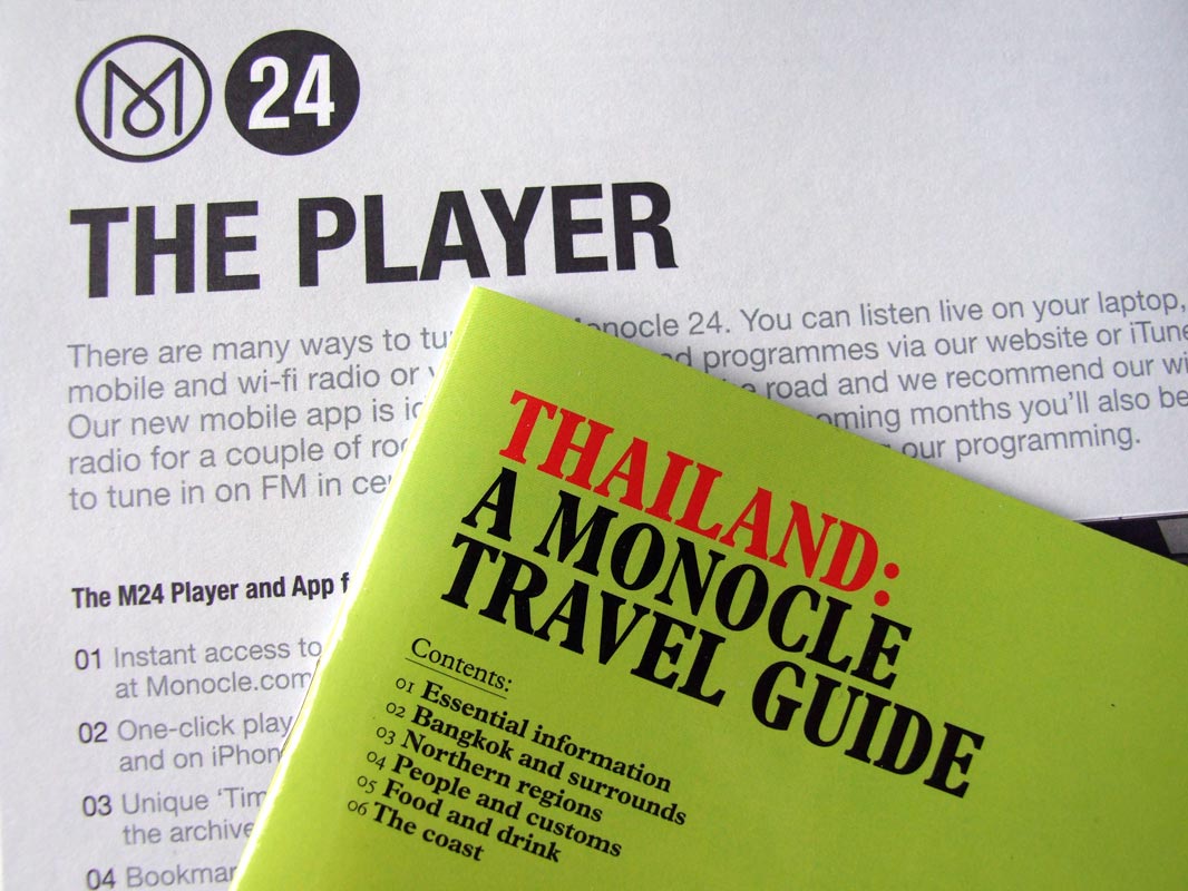
Monocle
My favourite magazine right now is Monocle.
The topics it covers – food, drink, travel and business – aren't really what interest me about it. It's the illustrations and the design in general that make me keep wanting to buy it each month. And since I'm so into the visual side of it, I've started to read it more. It's also one of the few magazines available from national stockists that doesn't use cheap glossy paper.
Friday, 24 August 2012
Thursday, 23 August 2012
The Form Book
Borries Schwesinger produced this superb book about form design.
The subject of the book was also the focus of Borries' dissertation earlier on in his career. He built upon his dissertation with more written and visual content in order to produce what I think is the only book worth reading if you want to learn more about forms. He talks about their history, design, and use. It's not common that people write about how designs are actually used by the general public but in this book it was unavoidable. So it's interesting to read what he says about how people use forms.
The book has a striking cover design. It's a pattern of alternating green diagonal lines with some low-key typography overlaid. He uses a thin stock for some of the first few pages that feature full-bleed images. Definitely something an all-round designer should consider adding to their book shelf.
The subject of the book was also the focus of Borries' dissertation earlier on in his career. He built upon his dissertation with more written and visual content in order to produce what I think is the only book worth reading if you want to learn more about forms. He talks about their history, design, and use. It's not common that people write about how designs are actually used by the general public but in this book it was unavoidable. So it's interesting to read what he says about how people use forms.
The book has a striking cover design. It's a pattern of alternating green diagonal lines with some low-key typography overlaid. He uses a thin stock for some of the first few pages that feature full-bleed images. Definitely something an all-round designer should consider adding to their book shelf.
Tuesday, 21 August 2012
Got a spare 3 minutes 29 seconds?
This video makes a run down of the 100 most valuable businesses in the world. They could have just put up a list of names but oohhhhh no, they dance for us! Nothing but 110% effort went into this . .
www.wwp.com
www.wwp.com
3 illustrators you might like
Malika Favre
She used to work at Airside – some really incredible illustrations that play with positive and negative space in a way that I've not seen in much other work. Ultra cool stuff.
Amy Martino
Watercolour-effects and clean lines. Subtle gradients, patterns, strong colours. Like it muchly.
Cristian Turdera
Intricate details, muted colours and an endearing, playful nature. His books are definitely the strongest form of his work I reckon.
She used to work at Airside – some really incredible illustrations that play with positive and negative space in a way that I've not seen in much other work. Ultra cool stuff.
Amy Martino
Watercolour-effects and clean lines. Subtle gradients, patterns, strong colours. Like it muchly.
Cristian Turdera
Intricate details, muted colours and an endearing, playful nature. His books are definitely the strongest form of his work I reckon.
Subscribe to:
Posts (Atom)
➔ Please do not copy any image from this blog without permission; I keep proof of ownership on all of my work ☺


